The 4 Numbers to Check Every Term: Program Health for Class Businesses
If you run a swim school, dance studio, martial arts school, or academy, you do not need forty charts at the end of a term. You need four numbers, compared with last term, and a clear next step for each.
A term that feels busy and a term that is healthy are not the same thing.
Here are the four numbers that tell them apart, where they come from in nnerb, and how to read them together.
Why four numbers beat a dashboard of forty
Most class businesses are not short of data. They are short of a ten-minute habit. At the end of each term you want to know whether the program is growing or shrinking, whether the room is full, whether the families who were here last term came back, and whether the money followed.
Those are four questions. nnerb's Program Health page answers them with four tiles, each one compared with the program's previous term, so you do not need a spreadsheet or someone to remember what last term looked like.
The four numbers on Program Health
Program Health is the analytics page for one program at a time. It picks a focus term, the latest term that has started and not yet ended, and compares it with the term before it in that program's own history. The four headline tiles are:
1. Enrolled
The number of distinct clients who are enrolled in, or have completed, the focus term, set against the previous term and your average per term. This is your growth number. If it is down, everything below is context for why.
2. Seats filled
Enrolled divided by the combined capacity of the term's class times. It is the number that tells you whether you have a demand problem or a scheduling problem. If capacity is not set, the tile says so; if capacity is under 10 seats, it is marked as a small sample.
3. Came back
Of the clients in the previous term, the share who are also in the focus term, compared with the same rate one term earlier. This is your retention number, and it is the one most businesses never measure until a term feels quiet.
4. Collected revenue
Payments allocated to the focus term's invoice lines, in your default currency. Payments in other currencies are counted and disclosed in the tile's description, not silently added or dropped. If nothing has been recorded against the term, the tile shows empty rather than zero.
An Outcomes tab adds two more tiles for the same comparison: Attendance (visits over visits plus recorded absences, with makeups and partial visits counting as visits and excused absences in neither) and Completed.
Below the tiles, Program Health turns the numbers into plain actions. If a class slot is under half full and has at least four seats, it names the slot and the count of open seats. If your return rate fell on a meaningful sample, it adds a retention action, and the "view list" button opens the client list filtered to exactly the people who did not return.
Reading the four together
Single numbers mislead. Pairs tell you what to do.
- Enrolled up, Seats filled flat: you added capacity and filled it. Healthy, if revenue followed.
- Enrolled flat, Came back down: new families are replacing leavers. Growth is hiding a retention leak.
- Seats filled low, Came back high: your families love you but you have too many slots. Consolidate a time or open the waitlist to a new age band.
- Enrolled up, Collected revenue flat: check for children attending without an invoice, or invoices waiting on payment. See how to close the term-start revenue leak.
The weekly view: Analytics Overview
Term-end is for the big questions. Week to week, the Analytics Overview is the single screen for "how is the business trending, and what should I change?"
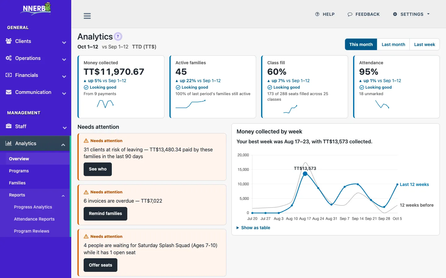
- Four headline tiles: money collected, active families, class fill and attendance, for this month, last month or last week, each compared with the period before.
- Needs attention: up to five cards covering overdue invoices, failed payments, families at risk, and open waitlist seats. The cards carry counts and money, never names.
- Opportunities: up to three positive cards, such as unmet waitlist demand, shown only when there are any.
- Money collected by week: the last 12 weeks against the 12 before, with a one-line takeaway and a "show as table" option.
- Four lenses: Programs ("Which programs are healthy?"), Families ("Who's slipping away?"), Progress and Reports, each opening the page that answers that question.
When nothing needs you, the page says so: "Nothing needs you right now." That is the goal.
The family side: lifecycle and churn
The Families page applies the same discipline to people instead of programs, with four tiles compared with the previous month:
- Active clients: clients with recent activity, now versus the end of last month, out of your active roster.
- Monthly churn: the share of clients active at the start of last month who lapsed during it, against the month before and your 12-month average.
- At risk: active clients showing warning signs today. On Growth this tile is locked; the Overview's Needs attention card still shows the count.
- New this month: first-ever activity this month, with last month for context.
"At risk" is not a feeling. The reasons on each family are specific: no visit in 14 or 30 days, attendance down against their own usual, a new client with few visits so far, an overdue invoice, or no progress update in 90 days or more. On Professional you get the named list with those reasons. For more on why this matters, read how to stop silent churn.
A 30-minute end-of-term routine
- Open Program Health for each program and note Enrolled, Seats filled, Came back and Collected revenue against the previous term.
- Act on the named slots: merge under-filled times, or offer open seats to the waitlist.
- Open the list of clients who did not return and decide who gets a personal message.
- Check the Families tiles for churn and at-risk, and follow up on the highest risk first.
- Finish on the Overview and clear the Needs attention cards.
A Caribbean class business running termly swim, dance or martial arts programs can do this on the Monday before the next term opens, while there is still time to fill a seat or call a family.
Which plan covers what
The Analytics Overview (including the at-risk count on its Needs attention card) and the Families page with its churn tiles are Growth features. Program Health, progress analytics, attendance reports and the named at-risk list are Professional, which is also the plan most schools choose. On Growth, the lens cards for Professional pages still show their number, with a lock and the plan name. Every new business starts with a 30-day Ultimate trial, then reverts to Starter.
Frequently asked questions
Which plan includes these analytics?
The Analytics Overview and the Families page (client insights, including churn) are on the Growth plan. Program Health, progress analytics and attendance reports need Professional. The named list of at-risk families is also Professional; on Growth the Overview's Needs attention card still shows the count. Every new business starts with a 30-day Ultimate trial, so you can try all of it before choosing.
What does a term comparison actually compare?
Program Health looks at the program's current term and compares it with the term just before it in that program's own history. The Families page compares with the previous month. When there is nothing earlier to compare, the tile says so instead of inventing a trend.
What if my classes are small and the percentages jump around?
nnerb flags small samples. A seats-filled figure for a class with fewer than 10 seats of capacity, or a return rate based on a small previous term, is marked as too few to call a pattern. Read those tiles as a prompt to look at the names, not as a verdict.
Does the Overview show me which families are at risk?
The Needs attention card shows how many families are at risk, plus counts for overdue invoices, failed payments and open waitlist seats. It shows counts and money, never names. The named at-risk list, with the reason for each family, is a Professional feature.
See your next term before it starts
Compare every term with the last, spot the families slipping away, and fill the seats you still have.
Start your free trialOr see how it works on the Reporting page, or compare plans.
